

Application Design
LehLah is a Fashion Styling tech application, whose aim is to generate looks for an individual within their own closet. The application can also be used to purchase clothing from small businesses and promotes sustainable fashion practices.
SKILLS & TOOLS
Interaction Design , Prototyping, Visual Design, Branding, Adobe Suite, Figma
ROLE
UX Design Lead
TIMELINE
Jan - Aug 2022
LOCATION
Remote
TEAM
Experience team
My contributions
Created a UI component library & designed end to end UI for the user
on-boarding in the application
Designed an onboarding experience to generate recommendations based on users body, fit & style; which drove 1,500 downloads & 800 active daily users in the first month
Conducted competitor analysis & user personas to created a unique brand identity for the users of the application
Worked closely with the client & development team to design and evaluate the interface to optimize functionality & aesthetics.
User personas
We put together two user personas that would appropriately represent an active LehLah user based on the user profiling data
Nineteen
Medical Student
Neha Gupta,
Single
Medium tech literacy
Mumbai, India
Neha spends most of her day studying, and in university. And hence, all of her other hobbies get pushed back in priority. when she the opportunity of a fun outing arises, she usually places bulk orders clothes on fast fashion brand websites the week before to dress for the occasion. Most of her time spent outside of books is relaxing, and spending time with family, leaving little time for her to organize her messy room or keep up with the latest fashion trends.
Frustrations
Core needs:
Yoga/ Sports in the mornings, Nutritional meals, Quite space to study, Walks in the evening

Neha has been invited to her best friends birthday dinner. The outing was planned last minute, & she doesn't have sufficient time to order clothes online, neither does she have time to dig through the piles of clothes in her wardrobe to string a formal dinner outfit together. Neha uses the LehLah application to find the perfect outfit from her own wardrobe for the dinner.
Possible scenario:
.png)
Competitor analysis
Comparative study
Who are they?
Stitch fix is the “personal style service for men and women that evolves with your tastes, needs and lifestyle.” they use a quiz to curate looks based on style and price range
With a focus on:
-
Technology
-
Personal styling
-
Curation
-
Personalisation
-
Sustainability & equity
Categories:
-
Men
-
Women
-
Kids
Nykaa is a “curated marketplace with an endeavour to inspire consumers to make fashion and lifestyle choices.” they use recommendation algorithms to create discovery-led experiences
With a focus on:
-
Curation
-
multiple options
-
multiple price points
-
Style
-
Quality
Categories:
-
Men
-
Women
-
Kids
-
Tech
-
Home
Sub-categories:
-
Jewlery
-
Accessories
-
Athleisure
-
Home & kitchen
-
Bath & Bath
Interface evaluation
Evaluation of on-boarding against the following principles:
1.
Constraints (Stitch fix) : Constraints in a design sense limit the number of choices a user can choose to act upon. The screenshot showcased displays the style quick on the stitch fix application.
Here, there is no option for the use to go back, skip a question, or skip the quiz as a whole, forcing the user to go through the multiple questions int he quiz, this could increase the drop off rate from the application all together


2.
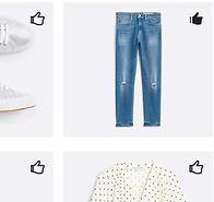
Consistency (stitch fix) : The Stitch fix application breaks consistency by making use of multiple different icon and button styles within the style preference quiz. Approaching interfaces with consistency is important from both a usability and branding standpoint.
In the screen shots on the left, the buttons vary from being black, to being grey/teal. The thumbs up icons vary in color, style, and fill.
3.
Hick -Hyman law of cognitive load (Nykaa) : The application breaks Hick-Hyman's law of cognitive load by having too many options available to the user on the landing page - increasing clutter. In turn, confusing the user & elongating the decision making process.


4.
Consistency (Nykaa) : The Nykaa application breaks consistency by making use of different accent colors within the application.
In the screen shots on the left, the color teal has been used to display sale prices, which strays away from the original accent color (pink) used on the rest of the application.
Journey mapping
On-boarding

Prototyping
On-boarding
Looks
Closet
Account
Cart
Feed
Reflections
Working closely with the client, development, marketing & design teams helped me learn how to effectively collaborate to meet the end goal
Collaborating with a team with designers from different industry backgrounds helped me broaden my design-thinking approach
Conducting more user-tests during the development of first version (low-fidelity) could have optimized the functionality of the application and cut down time taken to audit the application
Creating a scheduled timeline that was strictly followed could have cut down the time taken in designing & re-designing